After posting Batman, it was suggested I try my hand at a Joker illustration. Based on a panel from Dark Knights: Metals #6 (Greg Capullo and Jonathan Glapion killed it) in simple pen and ink. It has probably been 20 years since I drew the Joker.
Drawn with an Edison Nouveau fountain pen and Lamy Dark Lilac ink (with a touch of green for his hair). The ink goes from a light lavender to a, well, dark lilac when layered. And it has a really, really neat green sheen that you can see in the jacket (click on the figure to embiggen', it is difficult to see on the scan).
Pen & Ink on 98 lbs paper 7x10
Here is the very quick gesture drawing in purple pencil (sensing a theme).
Showing posts with label brush drawing. Show all posts
Friday, June 22, 2018
Sunday, June 17, 2018
Bad Anatomy Batman
It started as an exercise to see how much ink my new notebook could handle (a decent amount as it turns out). However, it did not turn out well for the Dark Knight's anatomy. Oooph. . I do like the chiaroscuro black and white contrast.
Pen & ink on 98 lbs paper 7x10
Thursday, June 07, 2018
Pure Pure American Look -- Brush Work
Back in the day (see below), I used to draw using a brush. Finding the old comic book pages has inspired me to start using a dip brush again. Comparing today's work vs the work I did as a 17, well, I have a long way to go to get back to that level of skill and ease.
Below is a HS project done in my junior year for Commercial Art class. We had to draw a fashion figure (hence the elongated proportions of the model; for fashion figures you use 10 head heights vs 7-8 head heights for normal figures) and create a newspaper add to go with it. This was before computer layout programs, so the lettering was hand drawn using a ruling pen. All individual images were captured via camera and pasted on card stock where I drew the border (also with ruling pen). The class was stressful, but I remember how much fun we all had. The class was 3 hours per day, and aside from all the projects that we worked on, we all created art to impress each other or make each other laugh (like MacGyvering a light box to create a Bat signal to shine into the classrooms across the quad).
The original figure and advertisement were too big to fit even on my 11x14 sized scanner!
Below is a HS project done in my junior year for Commercial Art class. We had to draw a fashion figure (hence the elongated proportions of the model; for fashion figures you use 10 head heights vs 7-8 head heights for normal figures) and create a newspaper add to go with it. This was before computer layout programs, so the lettering was hand drawn using a ruling pen. All individual images were captured via camera and pasted on card stock where I drew the border (also with ruling pen). The class was stressful, but I remember how much fun we all had. The class was 3 hours per day, and aside from all the projects that we worked on, we all created art to impress each other or make each other laugh (like MacGyvering a light box to create a Bat signal to shine into the classrooms across the quad).
The original figure and advertisement were too big to fit even on my 11x14 sized scanner!
Tuesday, May 08, 2018
More Envelope Art with School House Rock
With the passing of Bob Dorough, the musical director of School House Rock, last week, several radio stations asked their listeners to describe their favorite song. I did not remember "Unpack Your Adjectives" until I looked up video on youtube. My favorite verse is:
What is your favorite School House Rock song?
Pen, brush & ink plus Tombow Dual Brush Markers on 80 lbs no 6 envelope
Ink only version
We hiked along without care.
Then we ran into a bear.
He was a hairy bear,
He was a scary bear,
We beat a hasty retreat from his lair.
And described him with adjectives!
What is your favorite School House Rock song?
Pen, brush & ink plus Tombow Dual Brush Markers on 80 lbs no 6 envelope
Ink only version
Tuesday, May 01, 2018
More Blue Devil. . .and the coming of Shockwave!
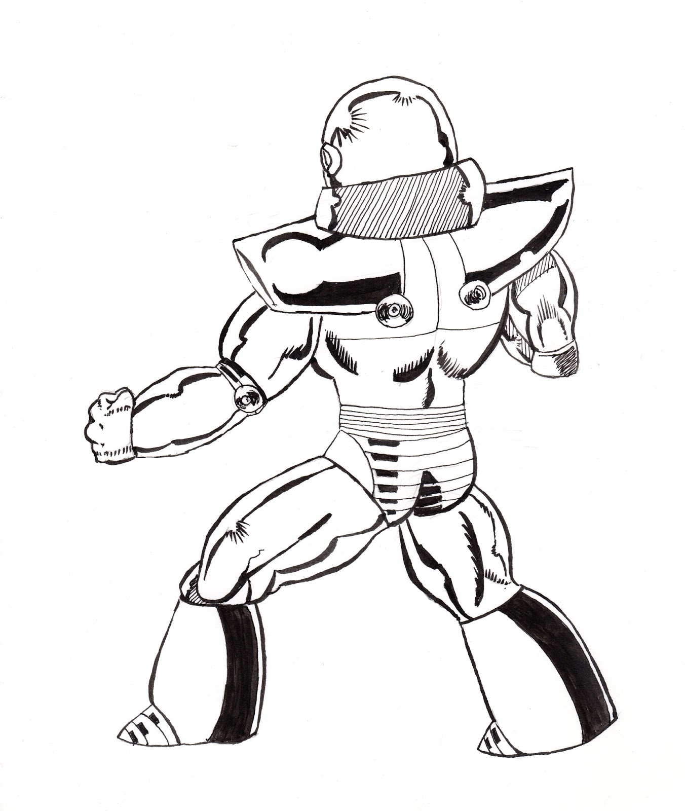
If Amazo was a C-lister, than Shockwave is a Z-lister. He first appeared in Blue Devil #2 (1984; I must have really liked the lovable loser characters back in the day). At the time I was a big, big fan of the artist Paris Cullins (who launched both Blue Devil in 1984 and Blue Beetle in 1986). I bought any book he was on and his art probably explains why all the Blue Devil love (did not know, but at that time he had recently graduated the DC comics "internship" program).
So, I found the other Blue Devil pages I mentioned previously. I must have been 17 or 18 when I drew the pages below. There is noticable improvement in them compared to the page I did when I was 14 (for starters, there is an actual attempt to add background). I do not know why I never finished inking, probably because I had no confidence in my ability to ink the buildings. I am not sure if I will go back and trace/ink these three pages but T really liked "the robot" so I made her a "pin-up" of Shockwave. We'll see if I ever finish these pages. It was fun to find these.
Hey look, there is actual background! Click to embiggen.
Blue Devil ain't doing so hot on this page, he better pick up his game.
There goes our hero! He rallies back, but how does it end?!?
So, I found the other Blue Devil pages I mentioned previously. I must have been 17 or 18 when I drew the pages below. There is noticable improvement in them compared to the page I did when I was 14 (for starters, there is an actual attempt to add background). I do not know why I never finished inking, probably because I had no confidence in my ability to ink the buildings. I am not sure if I will go back and trace/ink these three pages but T really liked "the robot" so I made her a "pin-up" of Shockwave. We'll see if I ever finish these pages. It was fun to find these.
Hey look, there is actual background! Click to embiggen.
Blue Devil ain't doing so hot on this page, he better pick up his game.
There goes our hero! He rallies back, but how does it end?!?
Sunday, April 22, 2018
Envelopes and Letters
Even though I had not posted anything until late March, I was still doing stuff, just not blog stuff. Mostly, I was working on my calligraphy by writing letters to friends, trying to stay in touch using a more tactile medium. And then decorating the envelopes with an illustration or cartoon. The cartoons would be Calvin & Hobbes, Winnie the Pooh, or the Peanuts gang. Depending on the illustration, I would use either be pen and ink, or some type of watwercolor-esque medium like below.
Below is a Calvin and Hobbes before I write the name and address on the envelope (I scanned the envelope before I added a few more branches for detail). These guys are a big, big favorite of mine.
Pen & ink and watercolor on 70lbs Sundance envelope
Just the pen and ink.
Below is a Calvin and Hobbes before I write the name and address on the envelope (I scanned the envelope before I added a few more branches for detail). These guys are a big, big favorite of mine.
Pen & ink and watercolor on 70lbs Sundance envelope
Just the pen and ink.
Subscribe to:
Posts (Atom)